
06
Apr
2022
Many of you will have had a website live on the net for many years now but it’s an ever changing beast. Technologies, design and user behaviours change all the time and mobile responsive websites are now an absolute necessity.
There are many articles out there which will go into a high level of detail about why your website should be mobile responsive but here are what we believe are the top three. Let us know what you think.
What Is A Mobile Responsive Website?
Put simply, a mobile responsive website is a website that responds to the width of the browser (Chrome, Firefox, Safari, etc.) and delivers content accordingly. If you are using a desktop or laptop then you expect to see the content across the screen, probably with some kind of navigation bar.
But if you are using a smaller device such as your mobile, a tablet or an iPad then you typically see the content elements stacked on top of each other so you can scroll up and down the screen. Typically you will have a ‘hamburger’ menu (Yes, that is what the three lines are called; bun, burger, bun) which you can tap and the vertical navigation menu appears.
So now we know what we are talking about, let’s have a look at the top three reasons why it’s useful to have a mobile responsive website.
The answer is over 65% of all internet traffic is coming through mobile phone, tablets, iPads, etc. That may sound high to you but have a think about how often you use the internet and how much of that is done on a laptop or desktop.
For us and many other people that sit in front of a computer screen most of the working week, it may be a little higher. But many people will necer even pick up a laptop these days.
If you are on the go, you reach to your pocket for your mobile. If you are home, you either do the same or pick up the tablet! So you can see how that 65% mobile traffic number comes up and it is only going in one direction too!
Reason 1. Make It Easy For Your Website Visitors
Surely the most important thing is to make your website easy to use for your visitors, right? We all work hard to get visitors to come to our websites and once they are there, we want to give them a great user experience so they can find what they are after, stay on the website and get in touch with you.
So, back in the day, we used to use a ‘pinch and squeeze’ method where we would zoom into see content. But let’s be honest, when we come across a website when we need to do that, the Back button is our next port of call. We’re out of here!
Now using the method where content stacks on top of each other along with a hamburger menu, our users can use the simple ‘flick and scroll’ method to navigate up and down the screen and find what you want them to see.
Reason 2. Get Better Google Rankings
People often ask us how to get further up the Google rankings. It’s not that simple as everyone wants that but Google do have a bunch of key indicators which form part of the algorithm which determines where your website will be ranked.
Mobile responsiveness is one of the key indicators and not having a mobile responsive website is a massive cross in the box for Google rankings.
Reason 3. Show All Your Content On All Devices
Ask yourself a question; if you are using a phone, mobile or iPad do you expect to see all the website content or maybe just a subset of that?
You know the answer and so with a mobile responsive website, all of your content is available but laid out in such a way that it works for all devices.
The design of a mobile responsive website can sometimes be tricky but that is the job of your web development team to get right.
What Should You Do?
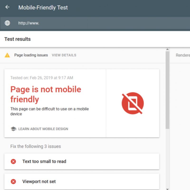
There is a simple tool that Google make available to determine whether a website is mobile responsive at https://search.google.com/test/mobile-friendly. Just put your website address in there and Google will tell you what they think.
If that tool comes back and tell you that it’s not mobile responsive then you really ought to do something about that.
Get in touch with us at Broadbiz on 01843 307060 and we can talk to you about getting this fixed for you.
Broadbiz provide services all across Thanet, Kent and beyond with 300+ customers across the UK.
© Broadbiz Web Services Ltd. 2005 - 2026 - All Rights Reserved
| Company Number: 05655248 Registered In England & Wales
| VAT Number: 277 6972 38
| Privacy & Cookie Policy
| Terms & Conditions
| ICO Registration Certificate